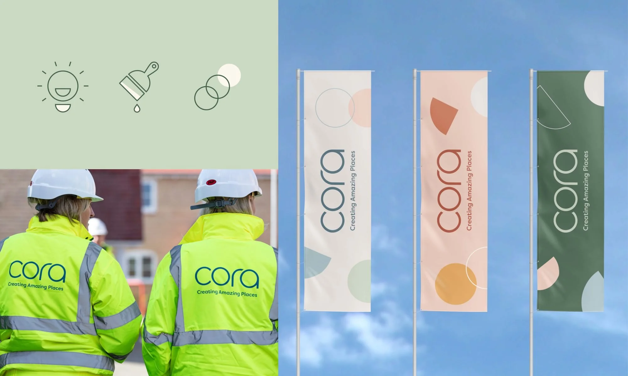
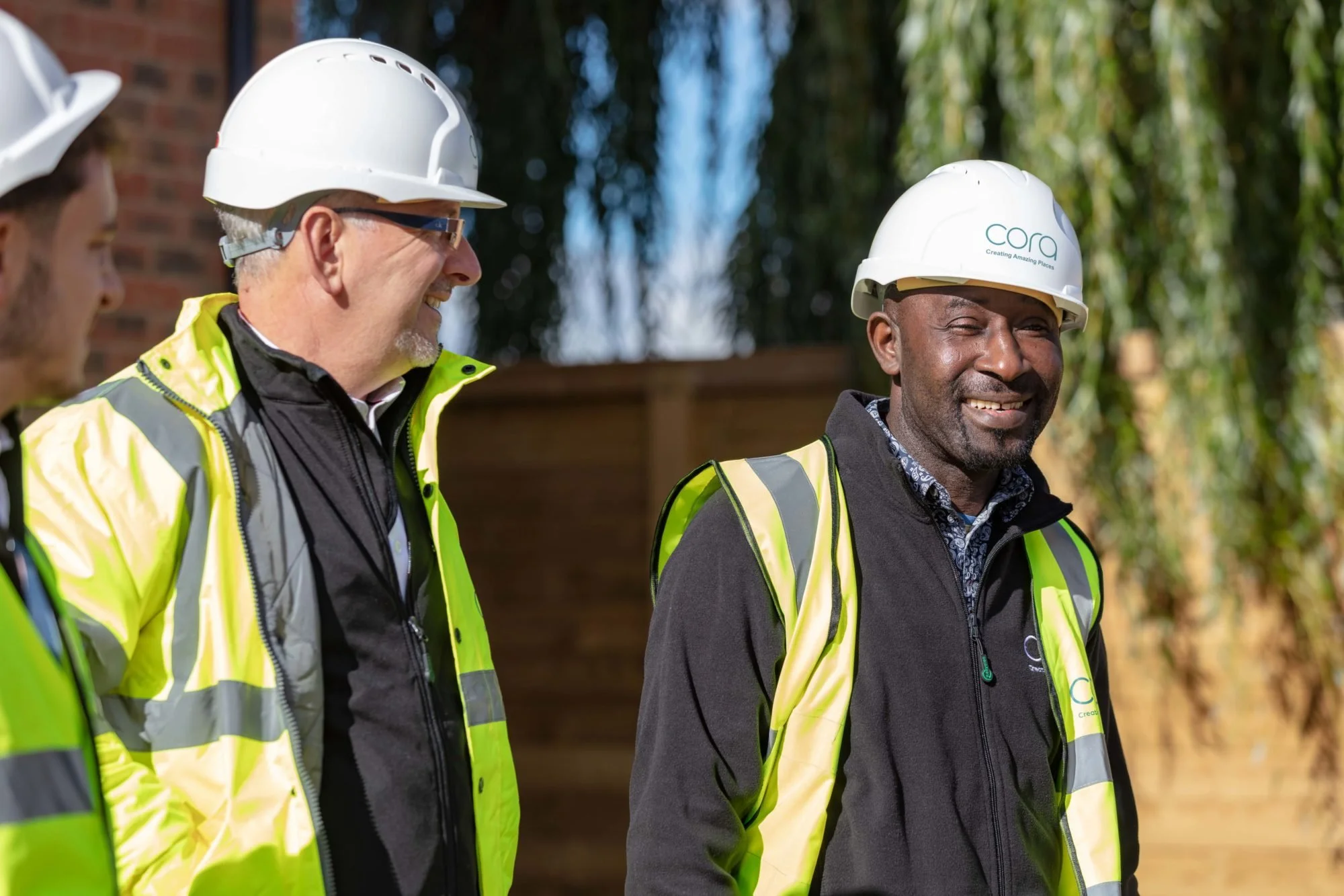
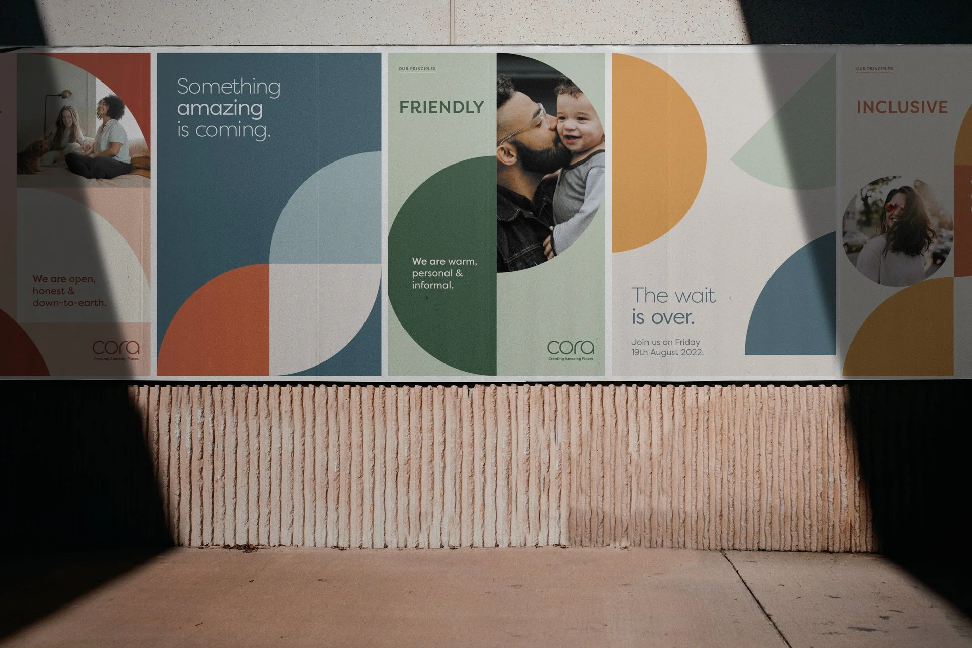
Cora
Barwood Homes had undergone a huge amount of growth and change, and therefore wanted to realign the brand to suit its ethos.
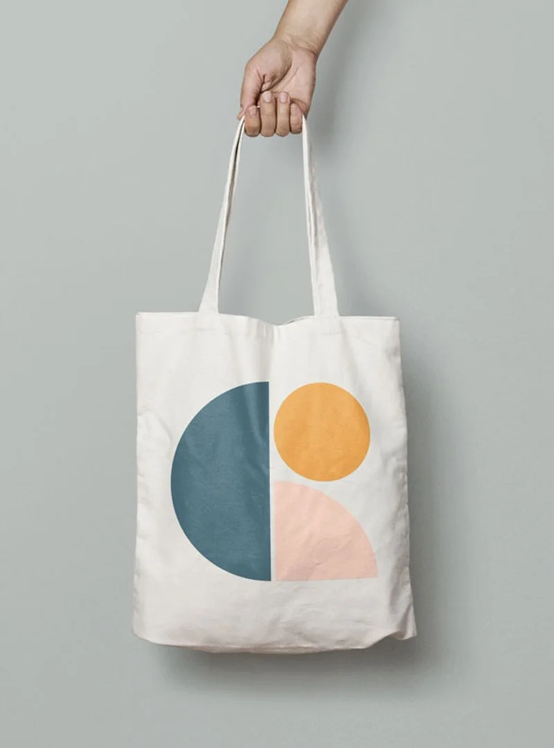
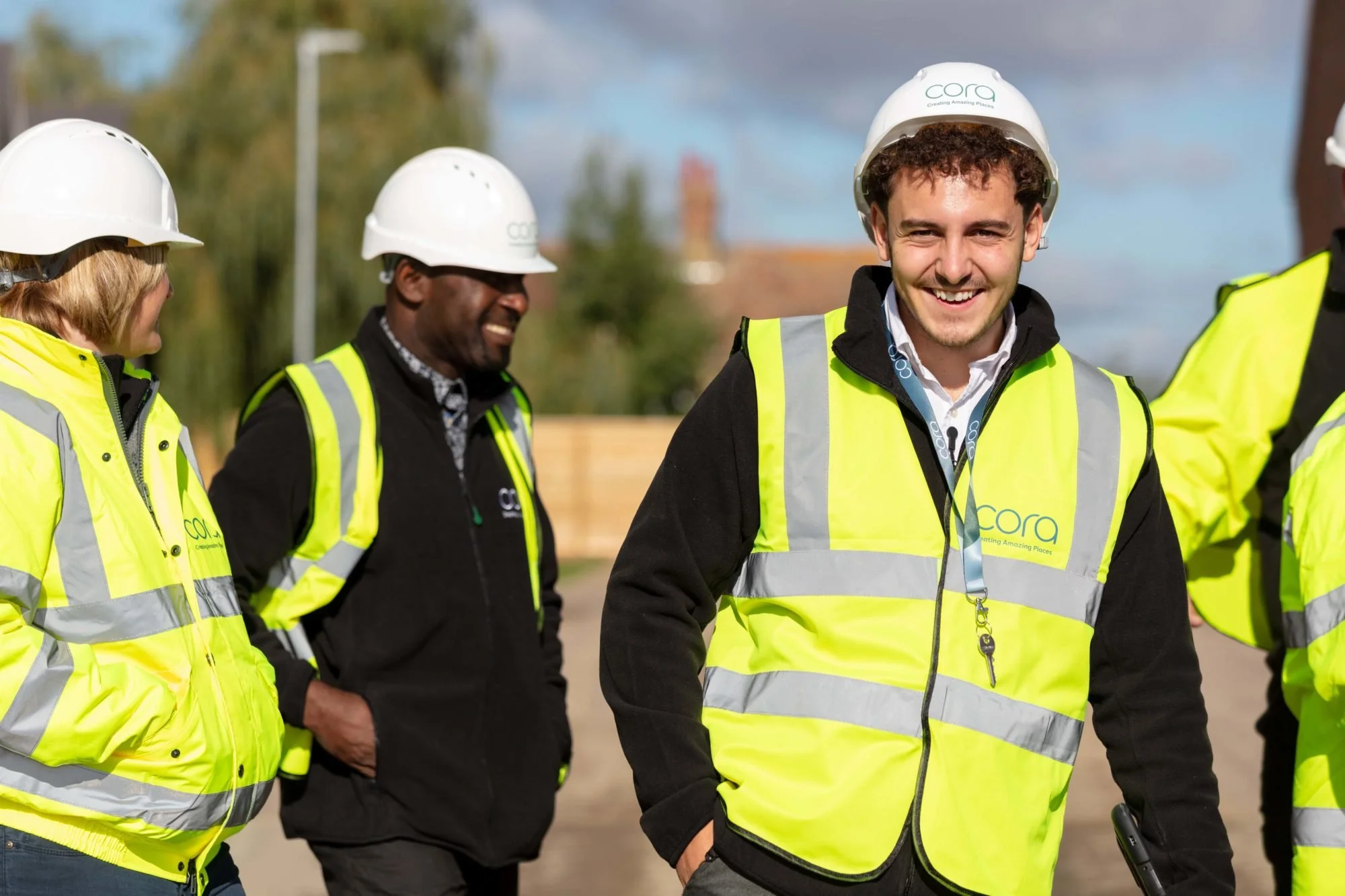
Cora puts sustainability at the heart of what they do, and so the brand was crafted with this in mind. The Cora brandmark itself communicates a sense of organic flow, whilst their new visual identity is built on their values: clear, inclusive, modern, and friendly.
✳ Naming
✳ Video
✳ Animation
✳ Brand identity + logo design
✳ Tone of voice + positioning
✳ Iconography
✳ Website design
✳ Social media management + content creation